In Freeman’s pursuit to “redefine live,” the leader in global events focused on modernizing their brand. Having first established a new logo, a set of primary colors and font family, we then partnered with their internal creative and marketing teams to extend the visual design system.
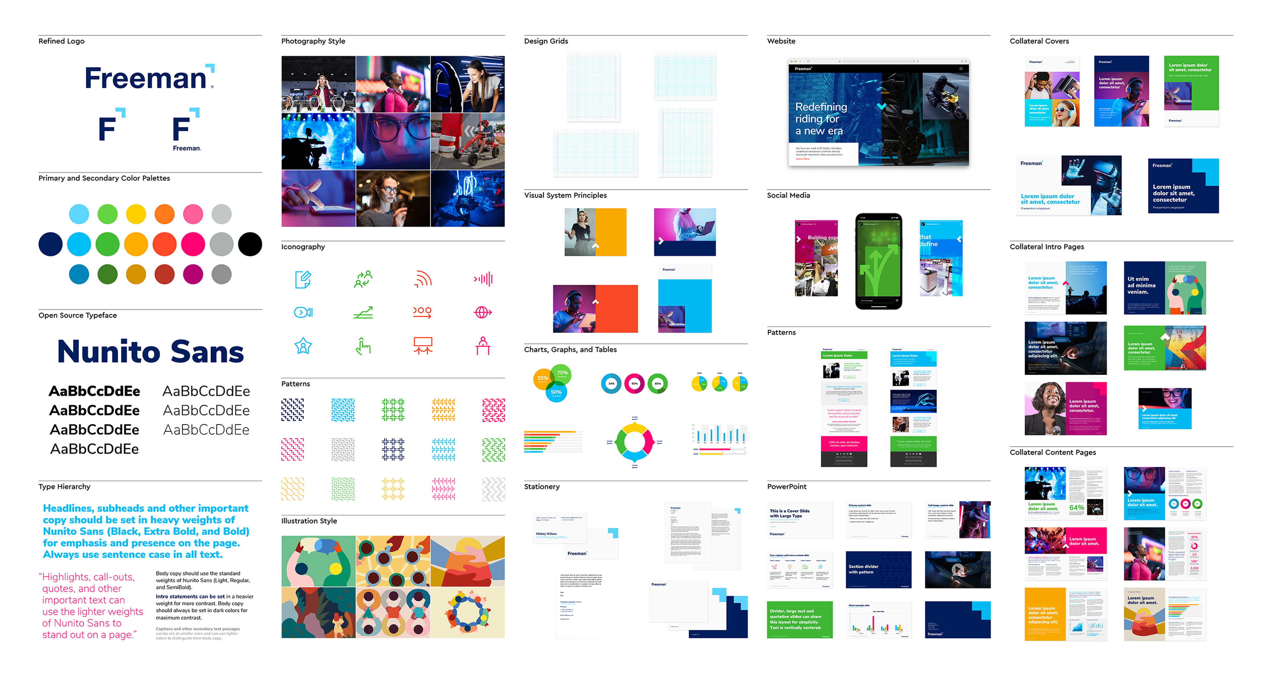
Freeman’s new logo incorporates the caret, a graphic emblem that is used as a directional symbol to signify “moving forward and looking ahead with optimism.” With this in mind, TenTen created a visual system that extended and brought to life the basic brand tools. Elements included: photography style, iconography, patterns, illustration style, charts and tables, stationery, PowerPoint templates and visual direction for the website, social media and collateral content.
“This was an incredibly collaborative project,” said Managing Director Sam Eliot, “the client team was full of creative and passionate people, making the visual outcome that much stronger.”
The extension of Freeman’s visual design system moves them closer to their future goals – allowing them to be more connected to the world of technology and innovation. Learn more about Freeman by visiting their website.