Today is October 10th—”TenTen Day”— and we're launching our rebrand. This isn't just a visual refresh. It's a strategic shift that reflects how we've evolved as a company over the past decade.
Since 2015, we've intentionally evolved our approach as the world around us changed. What began as strategic implementation focused on physical touchpoints has evolved into sophisticated digital transformation support, spanning automated workflows, digital asset management, and AI-powered brand tools that enhance implementation efficiency and maintain consistency at scale. Our methodology deepened from directive guidance to collaborative partnership, embracing the human side of organizational change.
This evolution was deliberate—we adapted our services as brands became more digital, more dynamic, and more distributed. But our brand expression hadn't kept pace with this growth.
When we applied our own evaluation criteria, the gap became clear. Does it reflect our "plan, build, manage" framework? Does it communicate our unique position as implementation specialists? Does it convey the empathy that now defines our approach? Our brand needed to evolve to match the sophistication of our business and rise to meet client expectations.
Our rebrand process followed our recommended methodologies. We didn’t cut corners just because it was us.
Business Strategy Alignment: Our new brand needed to reflect that we've evolved from execution-focused vendors to strategic implementation partners who guide critical decisions throughout the brand change process.
Digital-First Visual Identity: As technologies had evolved, so did our need to keep current and think past print. Our visual identity had to work on screens, in videos, in digital experiences.
"When I first started, implementation was primarily about print and physical items. But, technologies and the way we do business have profoundly evolved. We not only needed to catch up, but be forward thinking, as well,” said Founder Darren Horwitz
Empathy Visualization: This was the big one. We’ve learned that rebranding isn't just about logistics—it's about people. Our rebrand needed to show warmth and human understanding, not just technical competence.
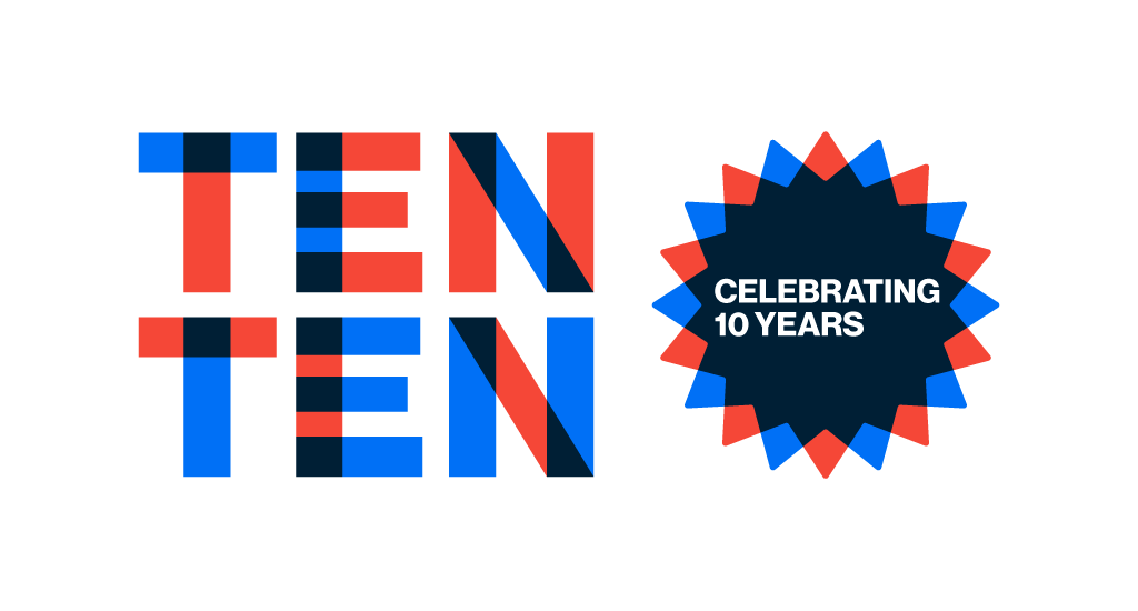
Our new visual identity represents our three core personality traits, and every design decision was intentional.
Pragmatic shows through in the structured, elemental quality derived from basic shapes and primary colors. No unnecessary flourishes—everything serves a purpose, just like our approach to implementation. The stacked, bold letterforms are straightforward and functional.
Confident comes through in those same bold letterforms that proudly telegraph our name with gravitas. There's a sense of assurance and expertise without being intimidating.
Empathetic appears in our color choices—bright blue that feels reassuring and warm red that adds vibrancy and human understanding. But here's the strategic part: when those two primary colors overlay and combine, they create a rich collaborative color that speaks to the strength of partnerships working together.
That overlay isn't just a design choice—it's a visual metaphor for how we work with our partners to help their brands reach full potential. When we combine our expertise (blue) with human understanding (red), we create something stronger together.
Even our typography choice reinforces this. We now use Neue Hass Grotesk Display Pro—a timeless, straightforward sans serif that balances pragmatism with human quality. Information is presented clearly to minimize confusion, but it can also flex to feel like dialogue and conversation with our partners.
Each element was designed to pass our own evaluation: Does it convey "quiet confidence"? Does it feel contemporary without being trendy? Does it work in motion and digital applications? Do our partners get the sense that we care for their brand and understand their creativity? The answer needed to be yes across the board.
The hardest part wasn't designing a new logo—it was being honest about who we'd become. We occupy this unique space in the brand ecosystem.
We're not a creative agency, and we're not a production vendor. We're implementation specialists who understand both the strategic and practical sides of brand change. That positioning needed to come through visually.
We followed our own advice—partnering with creative specialists for the brand development, then taking the lead on implementation and extension. It's the collaborative model we champion: leverage the best talent for each phase, then execute across touchpoints.
The biggest insight from our rebrand? Even we underestimated how much brand change affects people.
Going through our own rebrand reminded us why our clients find this process challenging. There's the practical stuff—updating every touchpoint, training the team, managing timelines. But there's also the emotional side—letting go of the familiar, embracing something new, hoping you're making the right choice. All of this on top of our day jobs!
“During this process, rebrand empathy took on a whole new meaning. I thought I'd be prepared from a time and emotion perspective, but rebranding your own company is a different type of challenge! Excited to be able to share more personal lessons with others as we continue to help them navigate brand change,” said Partner Beth Mallow.
That's exactly why our new brand emphasizes empathy alongside expertise. We're not just helping you execute faster—we're helping you navigate change in a way that brings people along rather than leaving them behind.
We're launching on 10/10 because it represents the strategic timing principles we apply with every client—finding the right moment that amplifies impact rather than rushing to market. After extensive discussions about launch timing, we chose to align with TenTen Day, our existing company celebration, making our rebrand part of a larger story about growth and evolution. It's the same thoughtful approach we bring to client launches: leveraging meaningful moments to maximize resonance and impact.
"I didn't want to launch our new brand for the sake of launching. I wanted this to be one of several proof points showing how we've evolved. Yes, we have a new identity. But, more than that, we have fundamentally changed how we do business and how we support our clients. In other words, we've grown and this refresh is an embodiment of that growth,” said Darren.
This rebrand isn't just about us looking more sophisticated (though we do). It's a proof point. When we tell clients that rebranding doesn't have to be overwhelming—that with the right planning, tools, and partnership, it can actually strengthen your organization—we want to show, not just tell.
We've applied our own "plan, build, manage" methodology to ourselves. We've used our evaluation criteria to ensure this rebrand actually serves our business goals. We've experienced firsthand what it means to balance sophistication with empathy, strategy with execution. And just like brands we partner with, we’ve answered questions around priorities, timing and budget.
In other words, we've walked the walk. And the process validated everything we believe about strategic implementation.
Your brand deserves to reach its full potential—a ten out of ten. We've just proven to ourselves that the journey there doesn't have to be painful.